Topics
packaging, brand, customer loyalty, promotion
Review the activity below or download the PDF student worksheet
- Student Worksheet: Tropicana’s Packaging Case Study
- Instructor Solutions (Members Only): Tropicana’s Packaging Case Study = Solutions
Student Discussion Activity
Introduction
For this activity we are going back to 2009 when Tropicana (brand of orange juice owned by PepsiCo) underwent a significant packaging redesign that did not go as planned.
Although this situation occurred a number of years ago now, it is a “classic” case study that all marketing students and practitioners should be aware of. It is especially useful for understanding the importance of packaging, branding, and what drives customer loyalty and repeat (habitual) purchases.
In most marketing textbooks, the role of packaging is relegated to a couple of pages of discussion, so it is not normally portrayed as ‘super important’ in the marketing mix. And while product packaging updates and improvements are also quite commonplace, especially for brands sold in a supermarket channel, we usually don’t expect to see a major downturn in sales – which is what happened in this case – so let’s now find out why.
About the Tropicana Brand
As mentioned, Tropicana is a PepsiCo brand, one of the leading snack and beverage companies in the world, with substantial data, knowledge and expertise in marketing consumer goods. In other words, when it comes to marketing consumer goods – they know what they are doing!
In addition to Tropicana, some of their other major brands include Pepsi (of course), Doritos, Quaker Oats, Mountain Dew, 7-Up, Cheetos, Lays, and Gatorade.
At the time of their packaging redesign, Tropicana was the market leader in the juice market in the USA, with an estimated market share of around 30-35% and an estimated sales revenue in excess of $700m (in the USA market).
Tropicana’s Brand Positioning
The brand was positioned at the premium (higher quality) end of the market, with a higher price point than most of its competitors. This higher price point was justified by the brand’s positioning, which emphasized being fresh tasting, natural, free from artificial ingredients, and healthy.
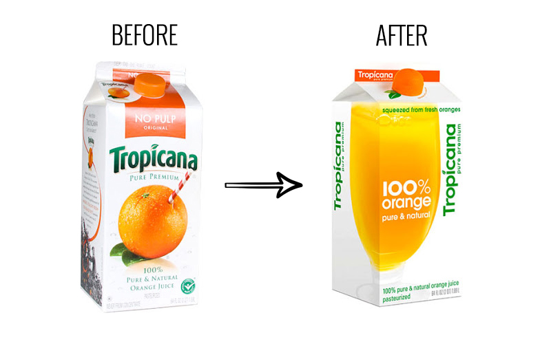
To help reinforce and build its positioning, on its original packaging (pre-2009), it highlighted the phrases “Pure Premium” and “100% Pure & Natural Orange Juice“.
And the main image on the original packaging was an orange with a straw sticking out of it to create the impression of freshness and that the juice is just like drinking straight from a real orange.
Tropicana’s Packaging Redesign
Tropicana’s new packaging design was introduced to the USA market in January 2009. This new design incorporated the following:
- Brand name: Tropicana = maintained
- Brand name alignment: from horizontal to vertical writing
- Brand tagline ‘Pure Premium’ = from all caps to all lower case letters
- Main image: an orange with a straw to a full glass of orange juice (which runs across two panels of the pack)
- Lid: from a screw top to a squeezy lid that looks and feels like an orange
- Copy (words): added ‘pasteurized‘
- Copy (words): ‘no pulp‘ replaced with ‘squeezed from fresh oranges‘
- Colors: strong color of orange was replaced with a paler orange juice color
- Overall: new packaging look appeared simpler and less busy
Rationale for Tropicana’s Packaging Redesign
As can be seen from the list of packaging redesign elements above, this change was a significant pack modification, not just a tweaking of one to two elements (which is often the case with visual changes).
So what was the thinking behind such a substantial packaging redesign? Here are some of the reasons provided:
- To clearly differentiate the brand and to ‘set it apart’ on supermarket shelves with a distinctive look
- To modernize the look and feel of the brand by creating a more sophisticated and ‘adult’ looking pack
- To reinforce its price premium positioning through classy, sleek and minimalist imagery on the pack
- To also use the minimalist design to communicate that the product was fresh, pure, and natural
- To demonstrate the product in action by showing the juice in an elegant glass, rather than an orange with a straw
- To create tactile engagement with the inclusion of the squeezy orange-like lid
Note: For more information and rationale of Tropicana’s packaging changes, please review the Peter Arnell (Ad Age) video below.
How Much Did the Campaign Cost?
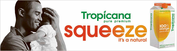
The packaging redesign cost was not publicly disclosed. However, along with the redesign’s supporting advertising campaign built around “Squeeze, it’s a natural” (see image below), some estimates put the total cost of the new packaging and its promotional campaign (across television, print, digital, and outdoor) in the vicinity of $30m to $50m.
But… Sales Fell
Sales started to decline quite quickly following the rollout of the new packaging. According to most reports, sales of Tropicana fell by around 20% over the first two months following the change. This equates to reduced sales revenue in this period alone of somewhere around $30m.
As a result, the brand managers at PepsiCo acted quickly and decided to revert back to their prior (original) packaging in an effort to reverse the negative sales trend and to rebuild their lost market share.
Driving their decision to go back to the old pack was that the brand identified that sales had suffered primarily due to the reduced brand recognition in-store and the emotional connection that regular customers had with the brand and its traditional packaging design.
Fortunately, with this relatively quick decision – which also aligned with consumer feedback – the brand was able to recover its competitive position within a short time.
Packaging Designer Video (Peter Arnell)
Student Discussion Questions
- As suggested in the information, why are most packaging changes quite minor and only change one or two elements at a time?
- Given that the product did not change – only the packaging – are you surprised that sales revenue fell by 20% (especially for a market leading brand)?
- Do you agree with the decision to reintroduce the old packaging so quickly OR do you think that they should have given consumers more time to get used to the new look?
- Review the list of packaging element changes (under Tropicana’s Packaging Redesign above) – given their objectives (refer to Rationale for Tropicana’s Packaging Redesign above) – which packaging changes do you agree with and would have implemented (if any) and which ones would you drop?
- Why do you think that sales fell by 20% after the new pack rolled out? Choose relevant reasons from the following list:
- The pack did not stand out and draw attention to itself
- It was no longer easily and quick recognized by regular customers
- It looked like a new product
- The new pack also suggested that the product taste had changed
- It now looked like an adult only (not a family) juice brand
- Its positioning and key benefits were now less clear
- The packaging was now boring and lacked excitement (or interest)
- The traditional and familiar straw in the orange image was gone
- Regular customers lost a sense of connection with the brand
- How would you summarize the key lessons from this marketing case study?
External Articles
Related Activities