Topics
- logo, branding, consumer behavior, brand identity, public relations, viral marketing, loyalty
Learning Objectives
- This case study helps students understand the risks and challenges of rebranding a heritage brand. It highlights how emotional loyalty, customer feedback, and market research influence branding decisions and strategic direction.
Review the activity below or download the PDF student worksheet
- Student Worksheet:
- Educator Solutions (Members Only): Cracker Barrel Logo Change Case Study = Solutions
- Download Editable Slides (Long-term Members Only):
- Also please see the video listed below at the end of the case
Student Discussion Activity
Introduction to the Cracker Barrel Logo Change Case Study
In 2025, Cracker Barrel made a move to update its long-standing logo. For almost 50 years, customers had known the brand by its “Old Timer” character sitting beside a wooden barrel, a symbol of tradition, nostalgia, and country hospitality. But as younger consumers shifted away from the brand, management decided it was time for a modern look.
The new logo sparked immediate controversy. Loyal customers and even investors reacted strongly, seeing the change as an attack on the company’s heritage. Within days, Cracker Barrel reversed its decision and restored the old logo. This case explores why the change failed and what lessons it teaches about branding, customer loyalty, and strategy.
Background and History of Cracker Barrel
Initial Store and Market Positioning
Cracker Barrel Old Country Store was founded in 1969 in Lebanon, Tennessee, by Dan Evins, a gasoline sales representative who wanted to create a distinctive roadside restaurant concept. At the time, interstate travel was expanding rapidly, and Evins saw an opportunity to build a business that combined food, hospitality, and retail into a single experience. The first location was attached to a gas station, designed to capture motorists seeking a meal and a break on long drives.
Their strategy and positioning were built around hearty, traditional Southern cooking in a warm, welcoming atmosphere paired with a country store selling nostalgic goods, candy, and home décor. This positioning resonated with the target market because it offered customers both comfort and familiarity. The Southern-style menu and cozy, welcoming environment provided a sense of home, while the attached country store with nostalgic goods and candy tapped into warm memories and traditions.
Market Development and Growth
From these beginnings, Cracker Barrel grew steadily across the American South and beyond. By the 1980s, the brand expanded beyond its regional roots, opening locations in the Midwest and on major highway corridors. Its strategy of situating restaurants near interstate exits gave it visibility to millions of travelers, while the distinctive rocking chairs on front porches and fireplaces inside became recognizable icons for the chain.
Over the years, Cracker Barrel developed a loyal customer base by offering more than just food. Each location was designed to evoke nostalgia for a simpler, slower-paced lifestyle. The décor included antiques, vintage advertisements, and Americana artifacts carefully curated to reinforce the feeling of stepping back in time. Customers could browse the attached retail store before or after their meal, purchasing everything from old-fashioned candy and toys to rocking chairs and seasonal gifts. This retail component provided a significant revenue stream and differentiated Cracker Barrel from traditional sit-down restaurant competitors.
The company grew rapidly during the 1990s and early 2000s, eventually reaching hundreds of locations nationwide. By 2024, Cracker Barrel operated around 660 restaurants across 40+ states, employing over 70,000 people. While still most concentrated in the Southeast and Midwest, its reach extended coast-to-coast, with locations often serving as familiar pit stops for families on long road trips. The roadside positioning remained central to its brand identity, as many travelers associated Cracker Barrel with comfort and predictability.
Building a Strong Brand
Cracker Barrel’s growth was supported by its strong financial performance and brand recognition. For years, it consistently ranked among the most recognizable casual dining chains in America. The company went public in the early 1980s, further fueling its expansion. Its focus on a value-driven menu, generous portion sizes, and an immersive, nostalgic atmosphere helped it defend against competitive pressures from fast-food outlets and other casual dining competitors.
The Changing Marketing Environment
By the 2010s and 2020s, however, the chain faced new challenges. Shifts in dining behavior, such as the rise of fast-casual brands and delivery apps, created new competition. Younger consumers sometimes saw Cracker Barrel as old-fashioned, while its traditional menu and décor appealed most strongly to older demographics. And the COVID-19 pandemic amplified these challenges, as its senior-heavy customer base was slower to return to dine-in experiences. By 2024, the company’s leadership openly acknowledged the need to modernize and attract younger audiences while trying to retain its loyal, nostalgic core, eventually leading to the logo change (and store redesign plans) in 2025.
Their Logo and Its Brand Meaning
The Old Timer Logo
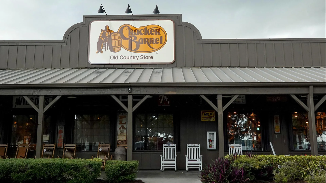
Cracker Barrel’s prior logo was introduced in the late 1970s, the design featured the name “Cracker Barrel” written in a rustic font on a golden background, along with an image of an older man in overalls sitting on a wooden chair beside a barrel. This figure, often referred to by fans as the “Old Timer” or “Uncle Herschel,” became the visual symbol of the brand’s promise of friendly hospitality and traditional country living.
The choice of imagery was intentionally designed to evoke nostalgia and feelings of olden days, which was consistent with their overall positioning. For example, the wooden barrel reflected the 19th and early 20th centuries, when general stores often kept goods for sale in barrels. And by placing a relaxed older country-looking man next to the barrel, the logo also evoked a sense of community, and familiarity. In other words, it communicated that Cracker Barrel was not simply a restaurant, but an experience and an opportunity to step back in time and enjoy the comfort of a simpler, more welcoming era.
The man himself, with his clothing and relaxed posture, provided a connection to rural Americana. And, over time, customers came to associate him with family road trips, Sunday breakfasts, and the comfort of Cracker Barrel’s menu offerings and atmosphere. In this way, the logo was more than a graphic, as it became a key icon in the Cracker Barrel offering and positioning.
The rustic typography reinforced the same message. The slightly curved lettering suggested a handcrafted, old-fashioned quality. And the tagline, “Old Country Store,” signaled that a visit was not just about eating but also browsing shelves filled with nostalgic merchandise, candy, games, and home goods.
As a result, many regular customers formed an emotional connection with the store, and its brand and logo design. Many regular customers would have seen the Old Timer logo as a reminder of family and memories. In effect, the logo extended beyond just a visual identifier to become a cultural anchor for the brand.
![]()
The 2025 Logo Change
Marketing Environment Challenges
By the mid-2020s, Cracker Barrel was facing a period of stagnation. Sales growth had slowed, profitability was under pressure, and competitors in both the casual dining and fast-casual categories were adapting more effectively to changing consumer tastes. Chains such as Texas Roadhouse and Olive Garden had refreshed menus, improved service speed, and invested in digital ordering and delivery platforms. And fast-casual players like Panera Bread and Chipotle continued attracting younger diners seeking convenience, modern branding, and healthier options.
Therefore, in this marketing environment, their well-established positioning (built around) nostalgia and tradition, was potentially evolving from a strength to a weakness, limiting its ability to grow and attract new customers.
The Need for Change?
Julie Felss Masino, who became CEO in 2023, stated that the brand risked becoming irrelevant if it failed to evolve. In investor presentations during 2024, she outlined that Cracker Barrel was “not as relevant as we once were,” citing falling dinner traffic and a predominantly older age customer base.
Market research indicated that while loyal older customers still valued the chain’s food and atmosphere, younger consumers often viewed Cracker Barrel as dated and overly traditional. The company concluded that in order to grow, it had to update its image and better appeal to millennial and Gen Z families without completely alienating its core. This approach is essentially repositioning the brand, which is always a tough challenge with a long-term and loyal customer base.
Why a New Logo?
The decision to update the logo was part of a broader three-year transformation plan that also included store remodels, menu innovation, and kitchen efficiency upgrades. The company took the view that the logo no longer communicated the modernity or freshness needed to attract new demographics, particularly in light of their repositioning goals.
And in the restaurant industry, there was a trend among more established brands to adopt simpler and cleaner logos. For example, Burger King had returned to a modernized retro design, Wendy’s had updated its typography, and Domino’s had dropped “Pizza” from its name to signal a broader menu.
The Logo Change
In late August 2025, Cracker Barrel officially unveiled its new logo. Gone was the Old Timer character, the rocking chair, and the prominent barrel illustration. The words “Old Country Store” were also removed, streamlining the identity down to wordmark only. (Please see comparison logo images above.)
The new design featured a somewhat similar font for “Cracker Barrel” on a similar golden-yellow background, which was shaped as a sideways barrel, with the overall effect being minimalist and intended to look more contemporary. Company executives described the redesign as both a nod to the brand’s roots and a step toward modernization, again consistent with their repositioning goals.
Their Chief Marketing Officer highlighted that the change was about versatility with media use, especially as the new design would reproduce more cleanly on digital platforms, social media, and signage. This was because the new logo would be easier to read on smartphones and apps, where increasingly large numbers of customers were engaging with the brand. Management stressed that while the imagery was evolving, the core values of hospitality, comfort, and tradition “had not changed.”
The company’s statements suggested that the logo redesign was a bridge between past and future. Indeed, the company highlighted that the original 1969 logo (an even earlier one) used a simple barrel image without the Old Timer, and suggested that the new wordmark only logo was in some ways a “return to roots.” By framing the change as honoring history while updating for the present, the brand looked to both reassure longtime customers while signaling to younger audiences that Cracker Barrel was not stuck in the past.
Weighing Up the Risks
As we know, all brand repositioning efforts carry a significant degree of risk, as the brand is reaching for a new market position while weakening their hold on their current position. It is clear that the brand recognized these inherent risks before their logo change decision. They were aware that the Old Timer logo was a deeply ingrained symbol of the Cracker Barrel experience, and that changing it meant tampering with emotional connections built over decades.
However, the leadership believed that the potential rewards – that is, attracting new customers and signaling relevance to investors – outweighed these risks. After all, being innovative and bold, adapting to market conditions, and staying current are essential components of any successful long-term marketing strategy.
Consumer and Market Backlash
Loyal Customers were not Impressed
The unveiling of the new Cracker Barrel logo was met with a wave of criticism from customers, investors, and online influencers. For many loyal customers, the removal of the Old Timer figure and the “Old Country Store” tagline felt like a betrayal of the identity that made Cracker Barrel special to them.
On social media platforms, long-time customers expressed outrage, with comments describing the logo as “soulless,” “generic,” and “bland.” Some went further, accusing Cracker Barrel of trying to become like “every other restaurant chain” by removing the distinctive imagery that had set it apart. It was then very clear that the Old Timer had become more than a logo, it was, in the minds of many customers, a member of the family, with some customers lamenting the loss of a “familiar friend”.
Petitions began circulating online calling for Cracker Barrel to reverse the decision. Within just a few days, thousands of signatures had been collected from customers demanding that the Old Timer return. The fast organization of these petitions demonstrated just how emotionally connected the brand’s audience was to its heritage. The backlash also extended into politics, with President Trump publicly calling on Cracker Barrel to “admit a mistake” and bring back the original logo.
Competitor Reactions
Even competitors saw an opportunity to weigh in. Steak ’n Shake, another chain with Midwestern roots, posted a tongue-in-cheek jab on social media, criticizing Cracker Barrel for “erasing its heritage” and suggesting that brands should embrace rather than abandon their history. This unusual move highlighted just how much attention the logo change was drawing across the restaurant industry.
Investor Reactions
The financial markets reacted as well. In the week following the announcement, Cracker Barrel’s stock price dropped by around 10%, wiping out more than $100 million in market value. And financial analysts warning that alienating the brand’s most loyal customers, who had delivered reliable sales for years, posed a risk to both short-term traffic and long-term brand equity. Some commentators described the rebrand as a strategic misstep that underestimated the importance of emotional loyalty in a heritage brand.
Reactions to the Store Redesign
Inside the remodeled restaurants where the new branding and updated décor had been introduced, reactions were similarly mixed. Some customers liked the brighter lighting and modern seating, but many complained that the stores no longer felt like “Cracker Barrel.”
There were reports of customers describing the new look as “sterile” and “depressing,” with one customer remarking, “If I wanted to eat in a generic modern restaurant, I’d go anywhere else. Cracker Barrel was supposed to be different.”
Who Owns the Brand?
The intensity and speed of the backlash demonstrated just how strongly customers felt a sense of ownership over Cracker Barrel’s image. While the company legally controlled its logo and branding, in practice the Old Timer belonged as much to the public imagination as it did to the corporation.
The backlash had sent a clear message that altering a symbol so closely tied to nostalgia, memory, and tradition was not just a marketing decision, it was a deeply personal issue for millions of customers. Within days, it was evident that the new logo had created more harm than goodwill, putting the company in a position where some form of damage control would be necessary.
Reinstating the Old Logo
The Old Logo is Back
By late August 2025, faced with mounting criticism and declining stock value, the company made the decision to reverse course and bring back the Old Timer. This U-turn was announced with what the company framed as a “We Hear You” moment.
In their official statement, Cracker Barrel acknowledged the passion of its customers and expressed appreciation for the feedback received. And by phrasing the reversal in terms of listening to their customers, the company reframed the incident as proof of its commitment to heritage and tradition. As part of this, management emphasized that while they had intended the redesign as a nod to heritage, they now recognized that the original imagery was itself inseparable from the brand’s identity.
Store Remodeling was also Paused
Along with reinstating the old logo, Cracker Barrel suspended its broader remodeling plans. Only a handful of stores had been updated with the new modern interiors at that time. These remodels were immediately halted, and the company pledged that the remaining 650+ locations would retain their traditional look and feel. This meant keeping the rocking chairs on the porch, the antiques on the walls, the fireplaces, and the peg solitaire games on every table. The Old Country Store concept would remain intact, and the nostalgic experience would continue as before.
The Sunken Cost of the Change in Plans
The decision was not without cost. Cracker Barrel had already invested significant time and resources into its transformation plan, reportedly setting aside hundreds of millions of dollars for updates. Halting the initiative meant accepting sunk costs and writing off parts of the investment.
Analysts noted that abandoning the remodel program left uncertainty about how the company would address its relevance problem going forward. Yet, management clearly concluded that the reputational risk of continuing outweighed the financial waste. Preserving customer trust was deemed more valuable than pursuing a strategy that alienated the core audience.
Spinning the Backflip
The speed of the reversal of the logo decision was unusual and reflected how quickly public sentiment can force change in the digital age. Within days of the logo launch, Cracker Barrel’s executives recognized that prolonging the controversy could damage the brand far more deeply and by acting decisively, they shifted the narrative from “Cracker Barrel abandons tradition” to “Cracker Barrel listens to customers.”
Customer responses to the reversal were immediate and positive. Social media posts thanked Cracker Barrel for “listening to the people” and celebrated the return of the Old Timer. Some who had threatened boycotts announced they would return. The company’s share price also stabilized, regaining some of the lost ground. The quick pivot, while embarrassing, ultimately contained the damage and allowed Cracker Barrel to reclaim its identity as a brand rooted in tradition and hospitality.
But, Where to Now?
Regardless of the outcome in the short-term, the incident raised questions about the company’s strategic direction. With the remodel program stopped and the logo restored, the modernization challenge for the brand remained unresolved. So the question remains, “How can Cracker Barrel attract younger diners without alienating its loyal base?”
Let’s Review a Video Overview of the Case
The following news video provides a great summary of this case study for students.
Student Discussion Questions
- Start by summarizing the key reasons given for Cracker Barrel’s 2025 logo change and their overall repositioning.
- In addition to the new logo, what other initiatives were planned by Cracker Barrel to help reposition the brand?
- Why is repositioning a brand considered quite challenging and what risks are involved?
- The case discusses the strong emotional connection that customers had with the old logo. Do you think that Cracker Barrel had kept the logo and just modernized their stores and menu that the backlash would have been as significant?
- Do you agree with Cracker Barrel’s decision to reposition and modernize the brand? Why/why not?
- Given that they have now paused and reversed their repositioning initiatives and “have listened to customers”, is their business financially secure or will they still need to implement key marketing mix and positioning changes at some time in the future?
- What are the key lessons from this logo change case study, given it was a loved heritage brand that was willing to reverse their decision after customer feedback? In other words, what advice and tips would you give to other heritage brand managers?
Related Activities
- Walmart’s Repositioning to Attract Higher-Income Shoppers
- Jaguar Rebranding and Repositioning Case Study
- Classic Case Study: Domino’s Turnaround Repositioning
- Classic Case Study: Old Spice Brand Repositioning
- Is Repositioning the Best Option?
- Successful Repositioning Video Case Study
- Repositioning the Cruise Ship Industry
- Repositioning Upwards (Video Case Study)
- New Coke Case Study (Part 1)